Scans By: Photovision Prints | Creative Lifestyle Blogger: Justine Celina
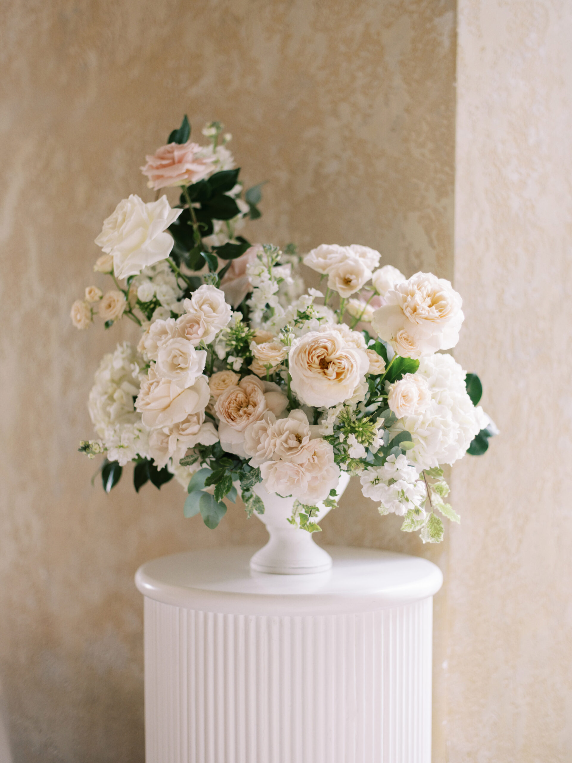
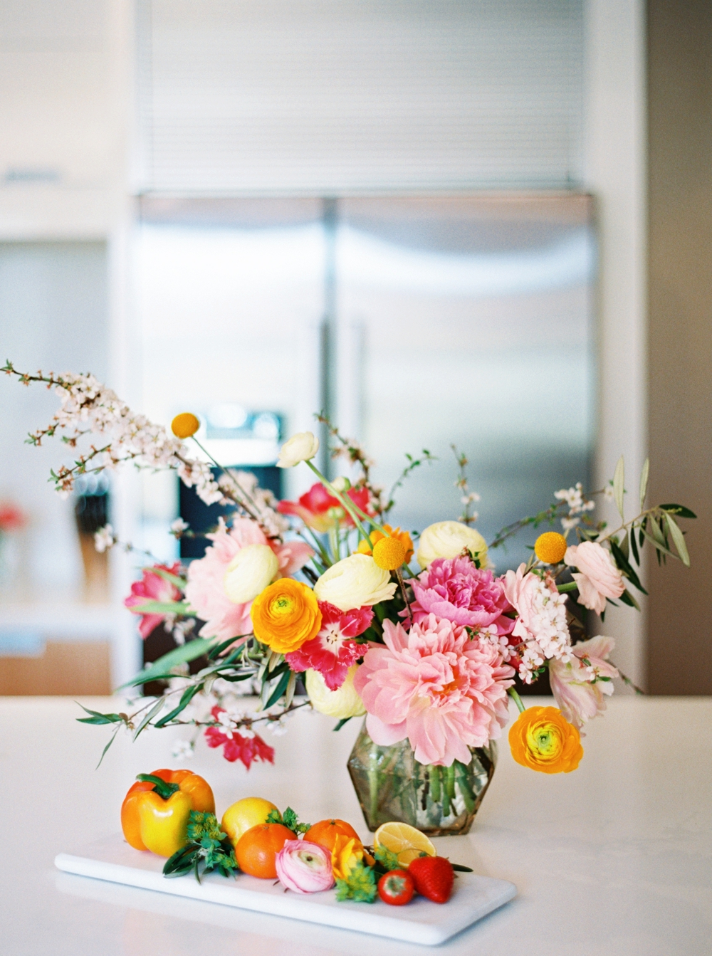
Flowers: Rebecca Dawn Design
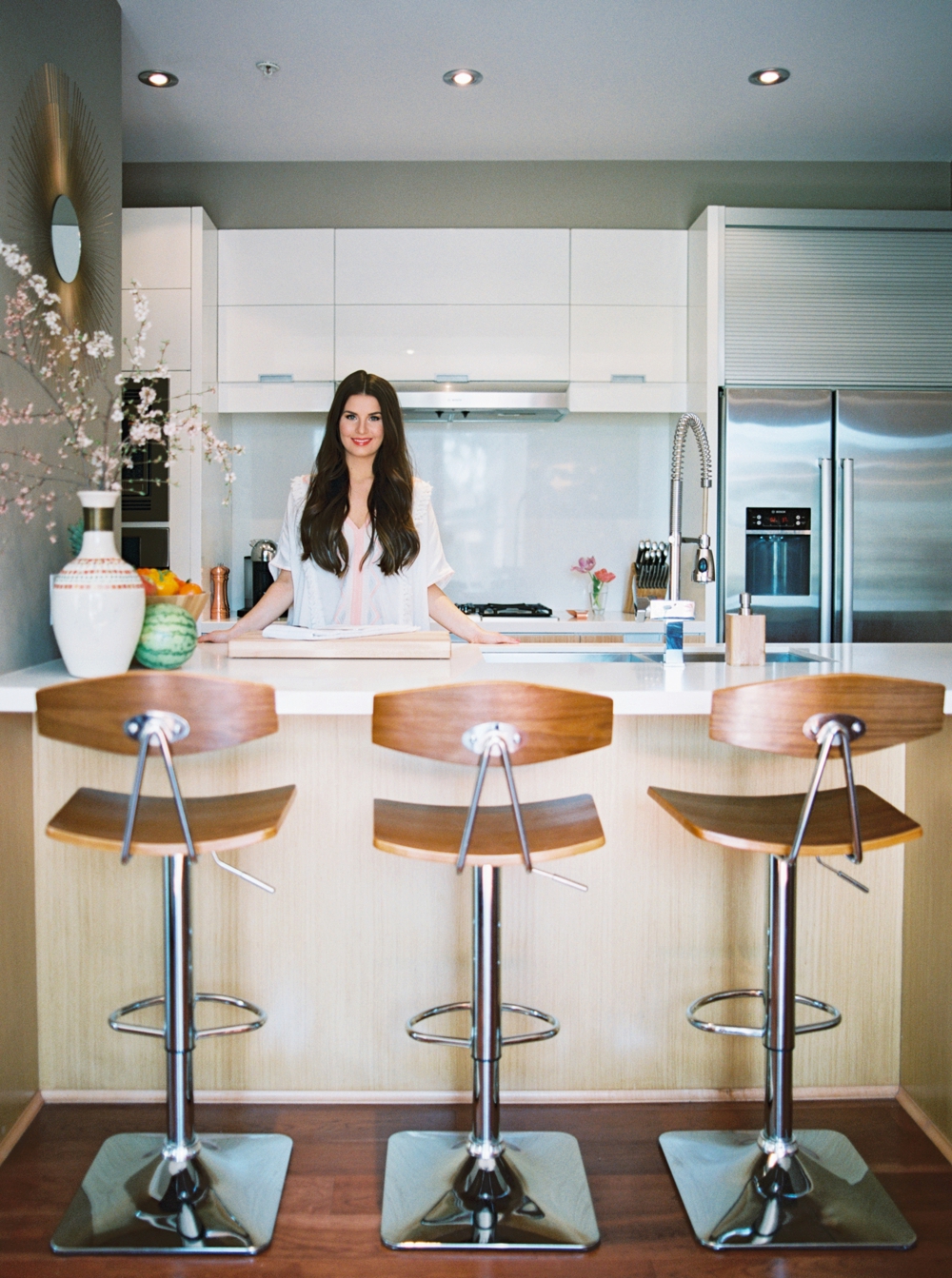
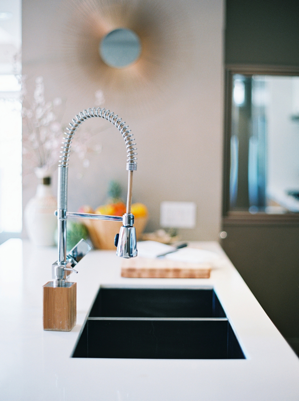
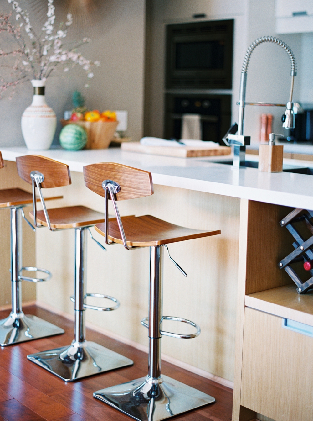
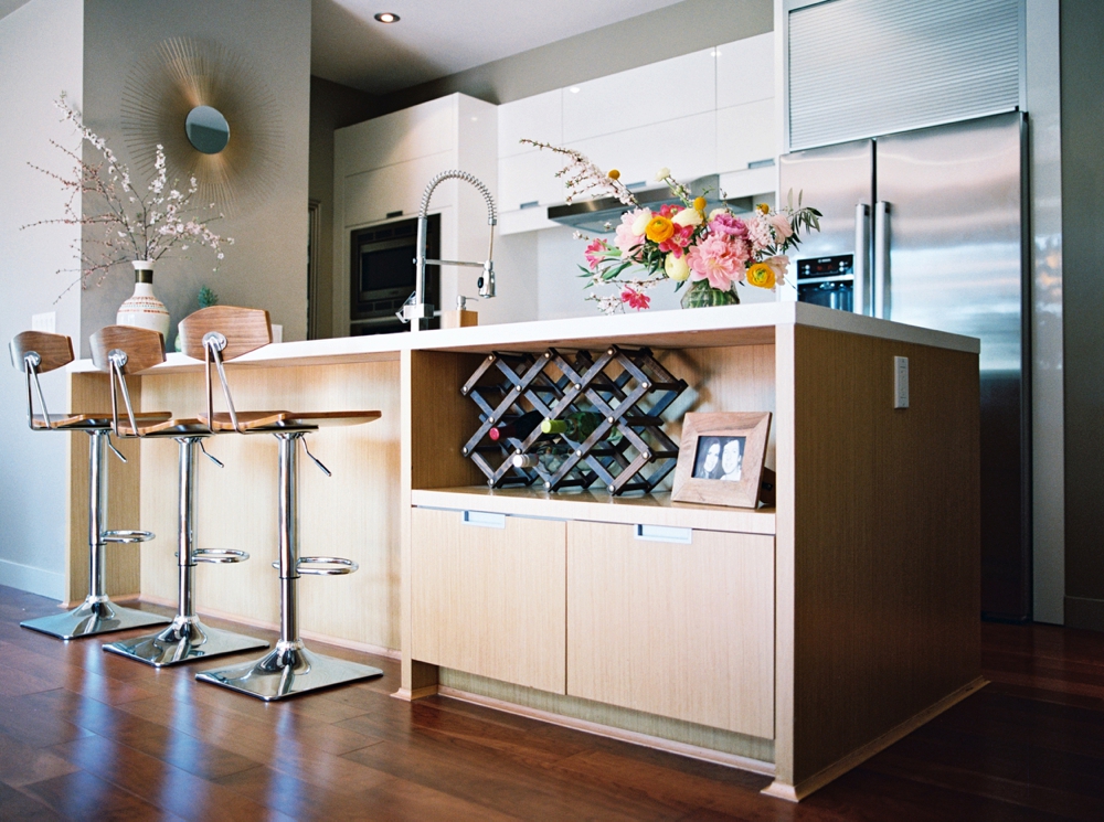
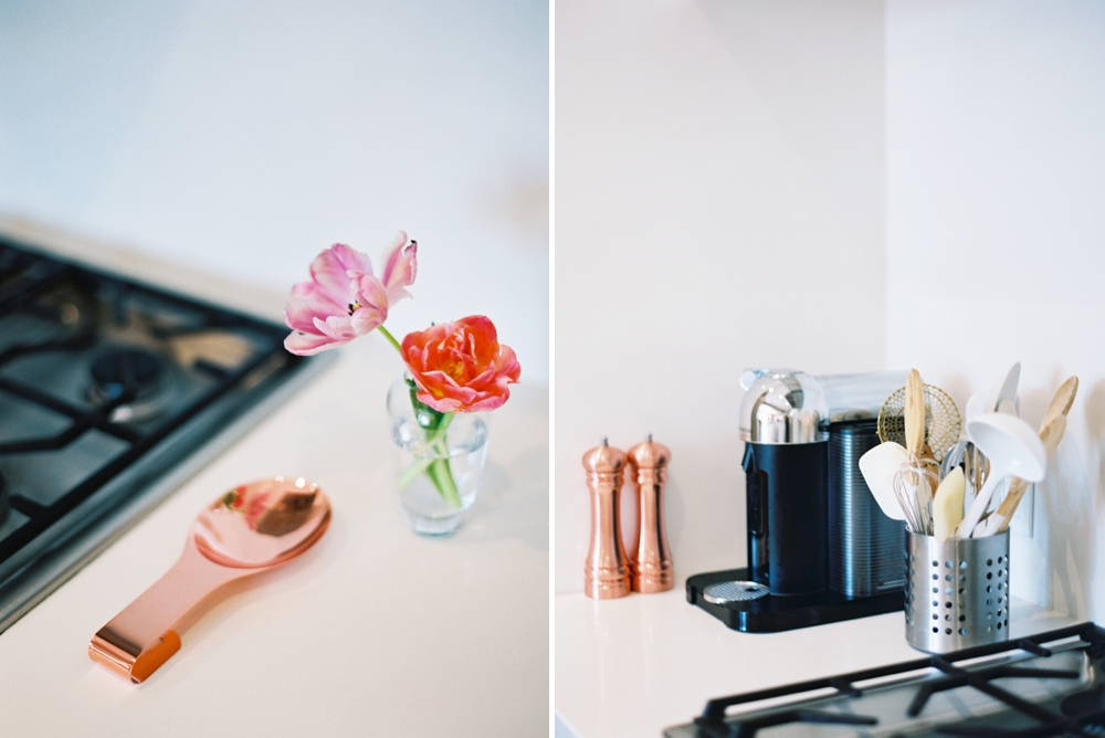
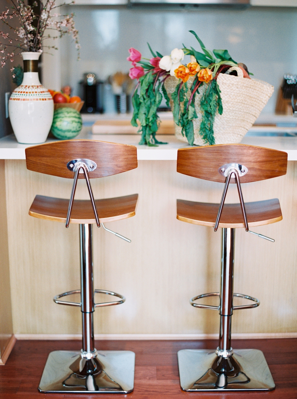
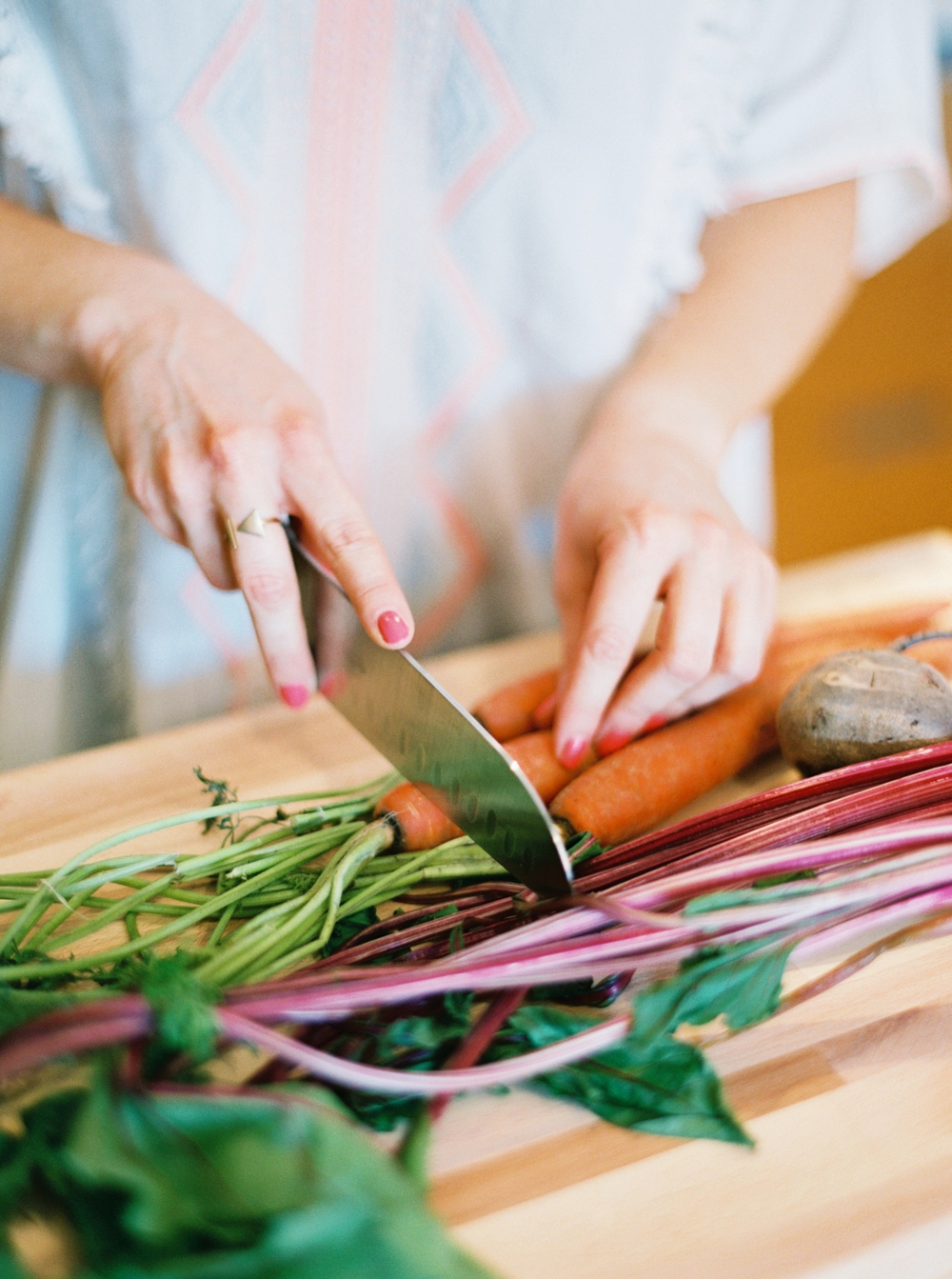
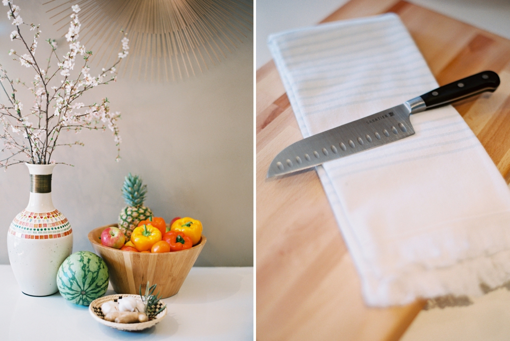
In Justine’s kitchen: Starburst Wall Mirror | Fruit Bowl | Marble Serving Board | Soap Dispenser | Salt & Pepper Shakers |Spoon Rest | Nespresso VertuoLine Chrome | Atelier Bar Stools | Cutting Board
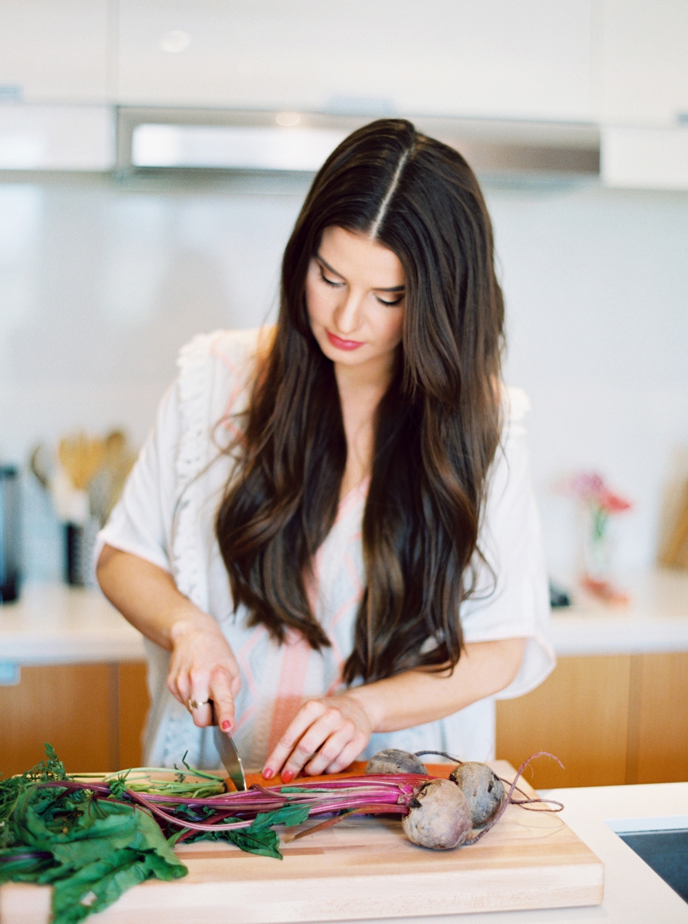
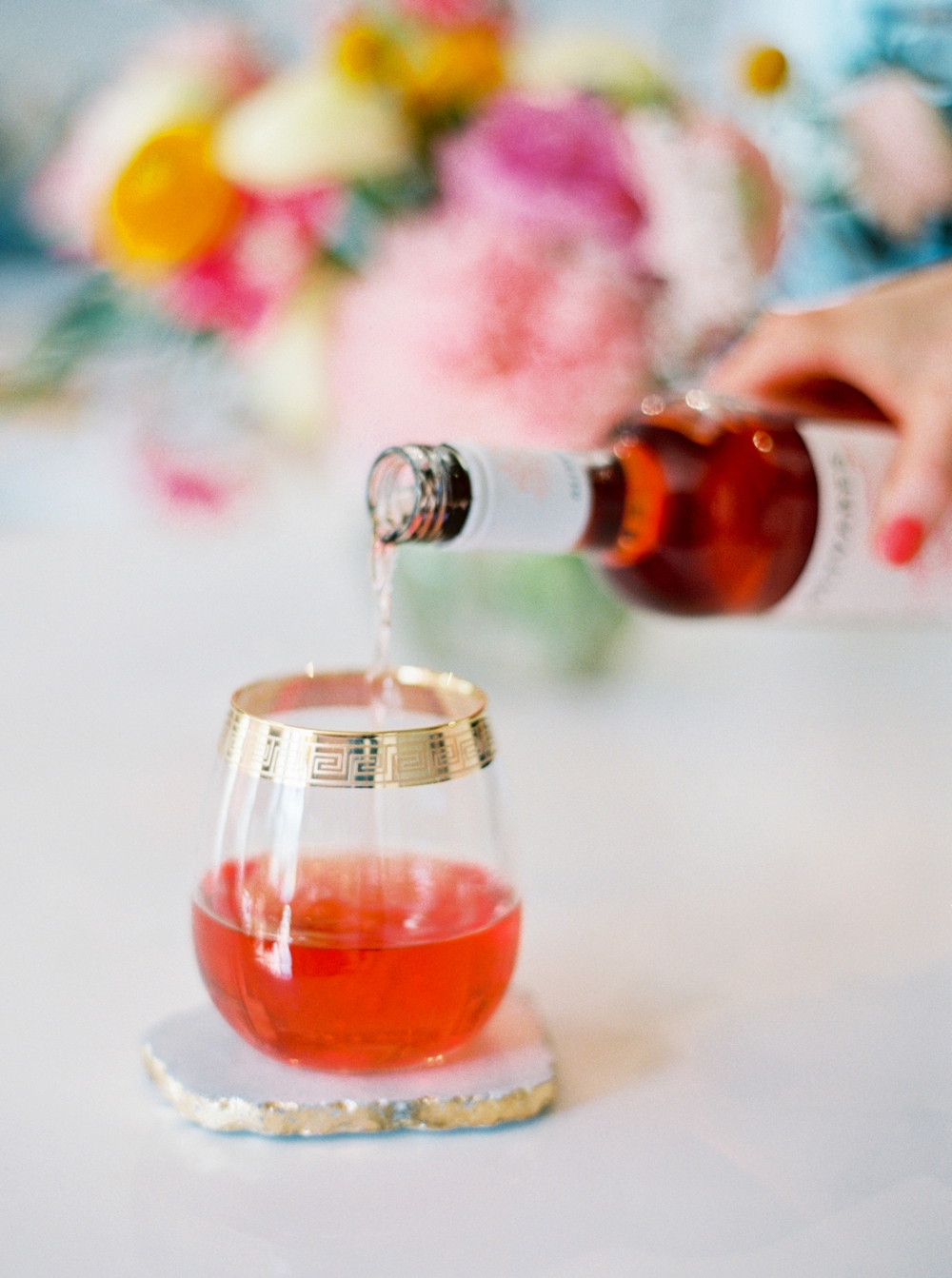
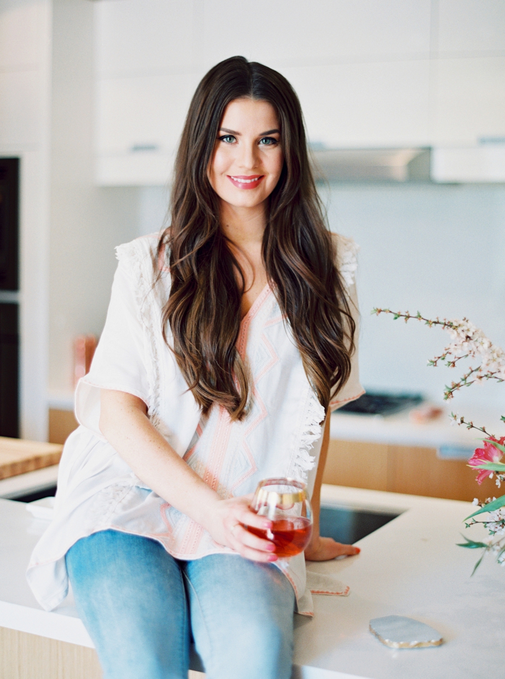
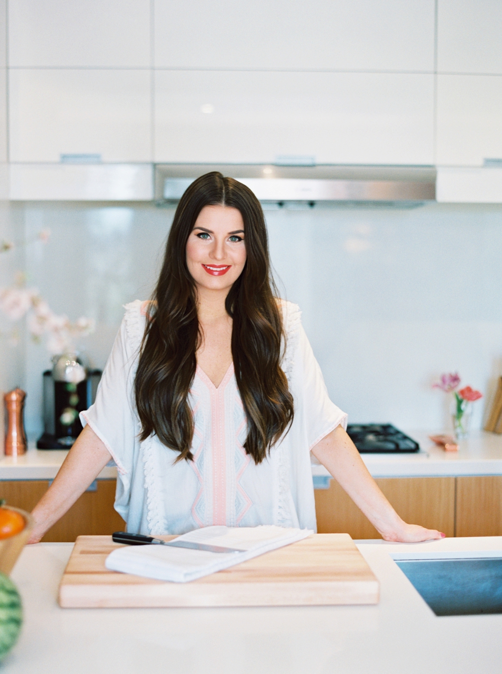
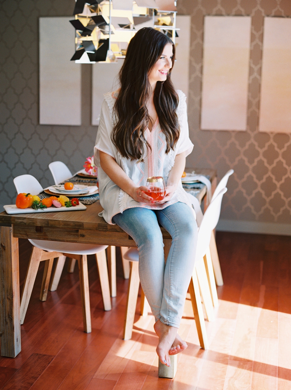
A few words from Justine Celina: I’m excited to share a look inside my kitchen as part of the In Search of Yummyness In the Kitchen With Series. Shareba and I are both members of the Food Bloggers of Canada and we’ve always enjoyed keeping up with each other online. I was honoured when she asked me to be part of her new series, where she takes a look inside the kitchens of her favourite bloggers! You can hop over to her post for the interview, where she asks me things like what’s in my fridge, what I make for dinner on a hectic weekday, what I like to serve when I’m entertaining and what my favourite restaurants in Calgary are. I also let you in on some of my biggest recipe fails since I’ve started blogging! In my post today I’m sharing lots more photos of our space, so come hang out in my kitchen — I have snacks, flowers and chilled rosé!
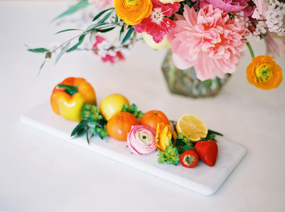
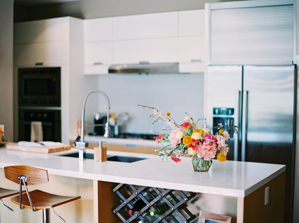
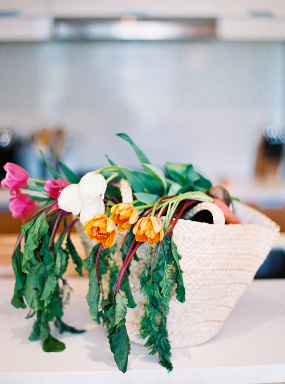
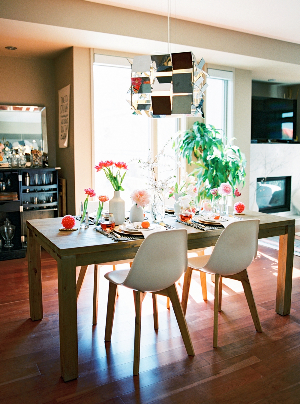
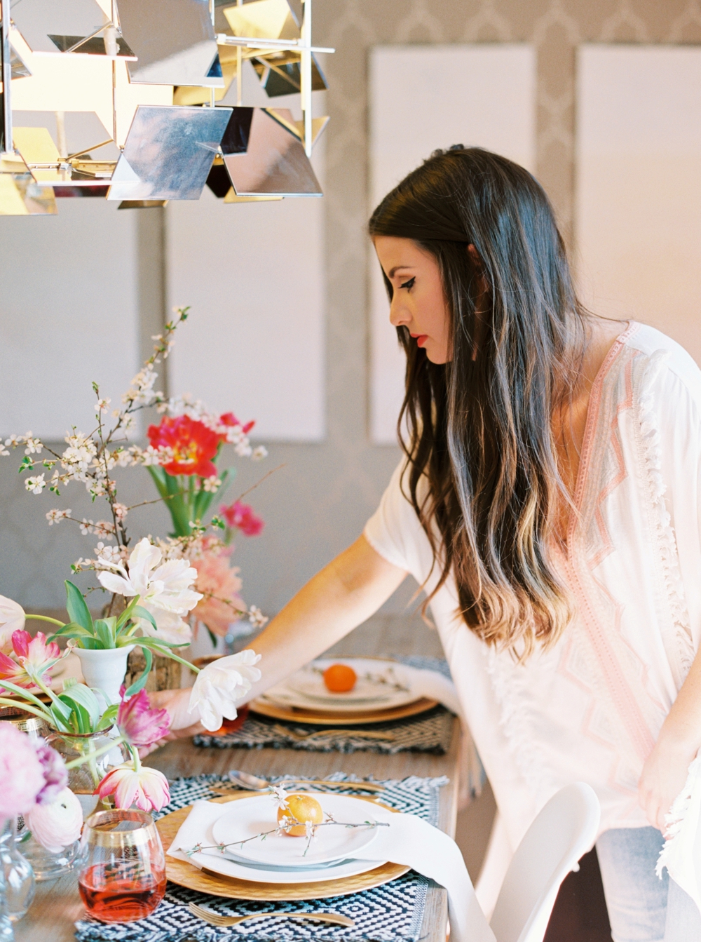
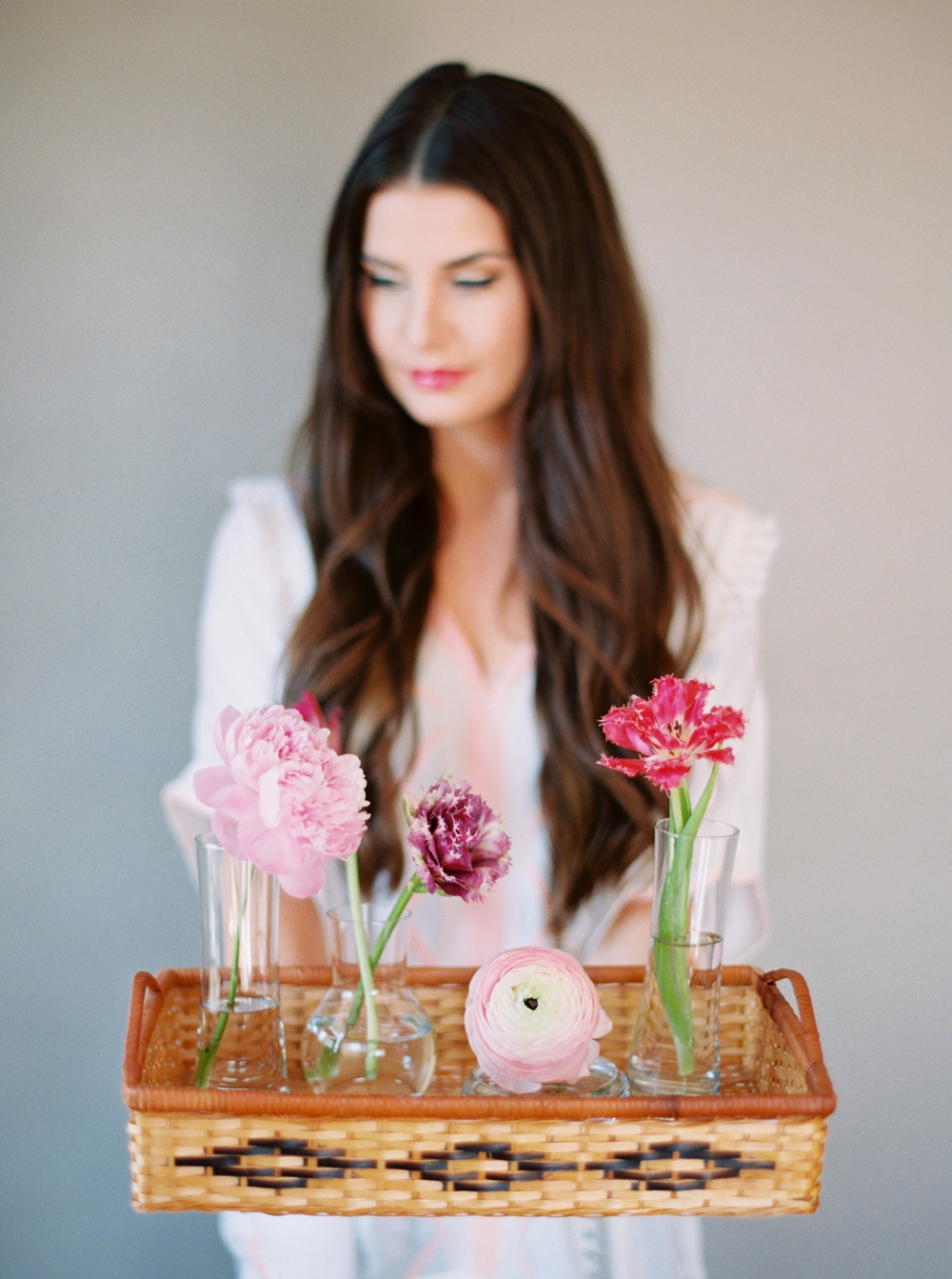
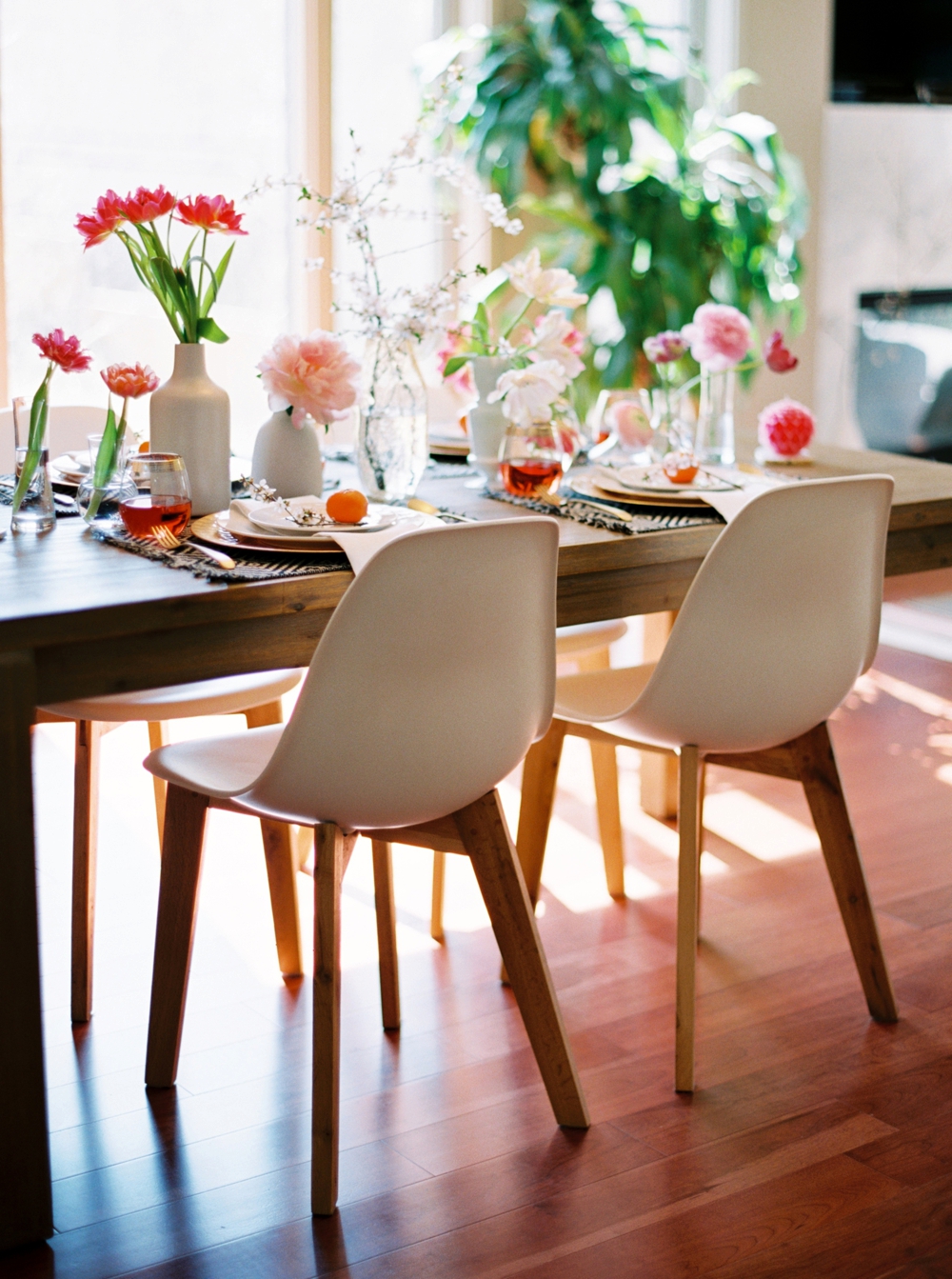
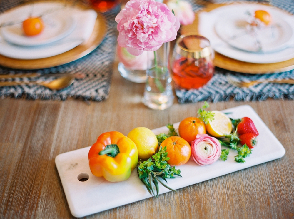
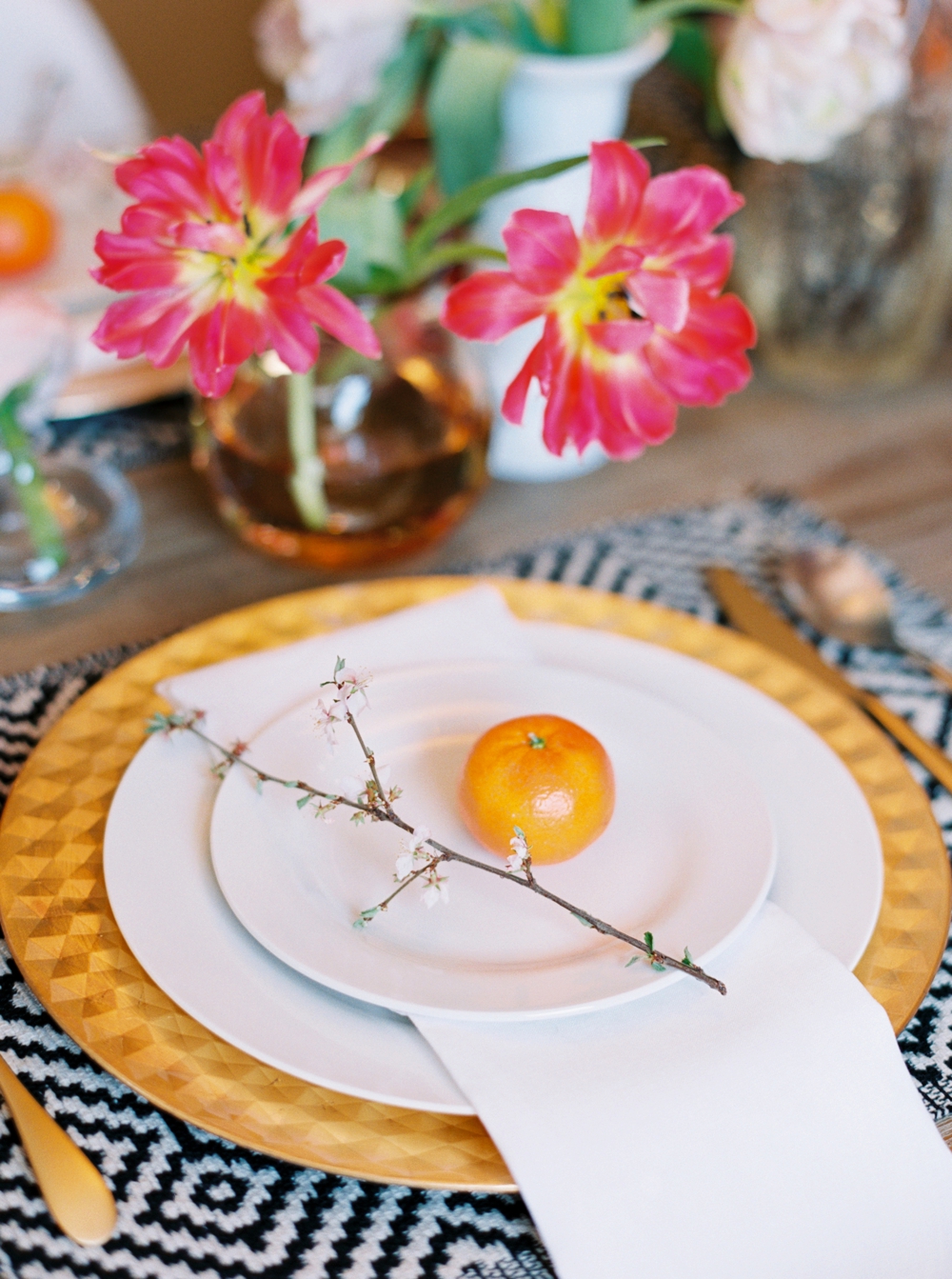
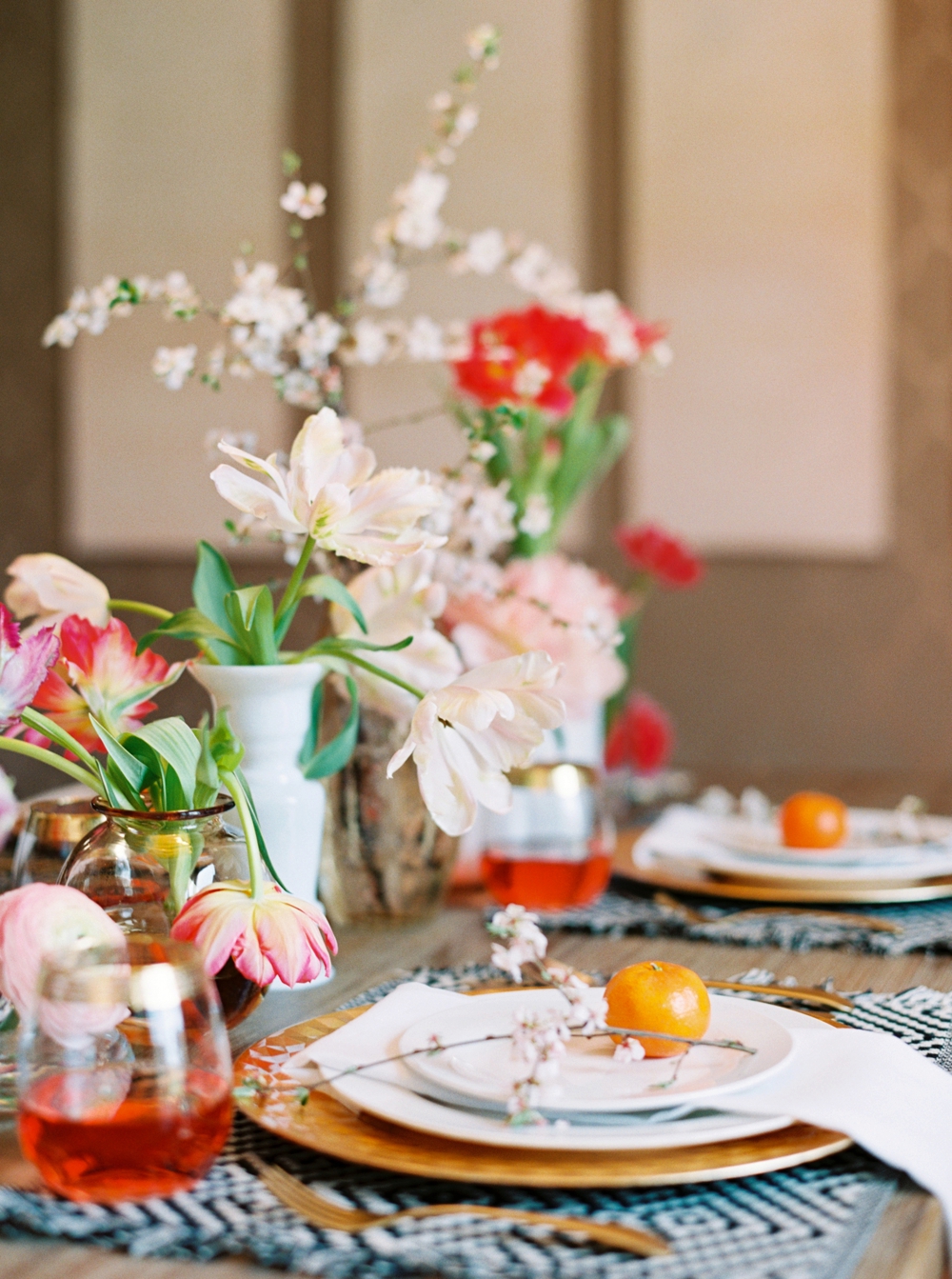
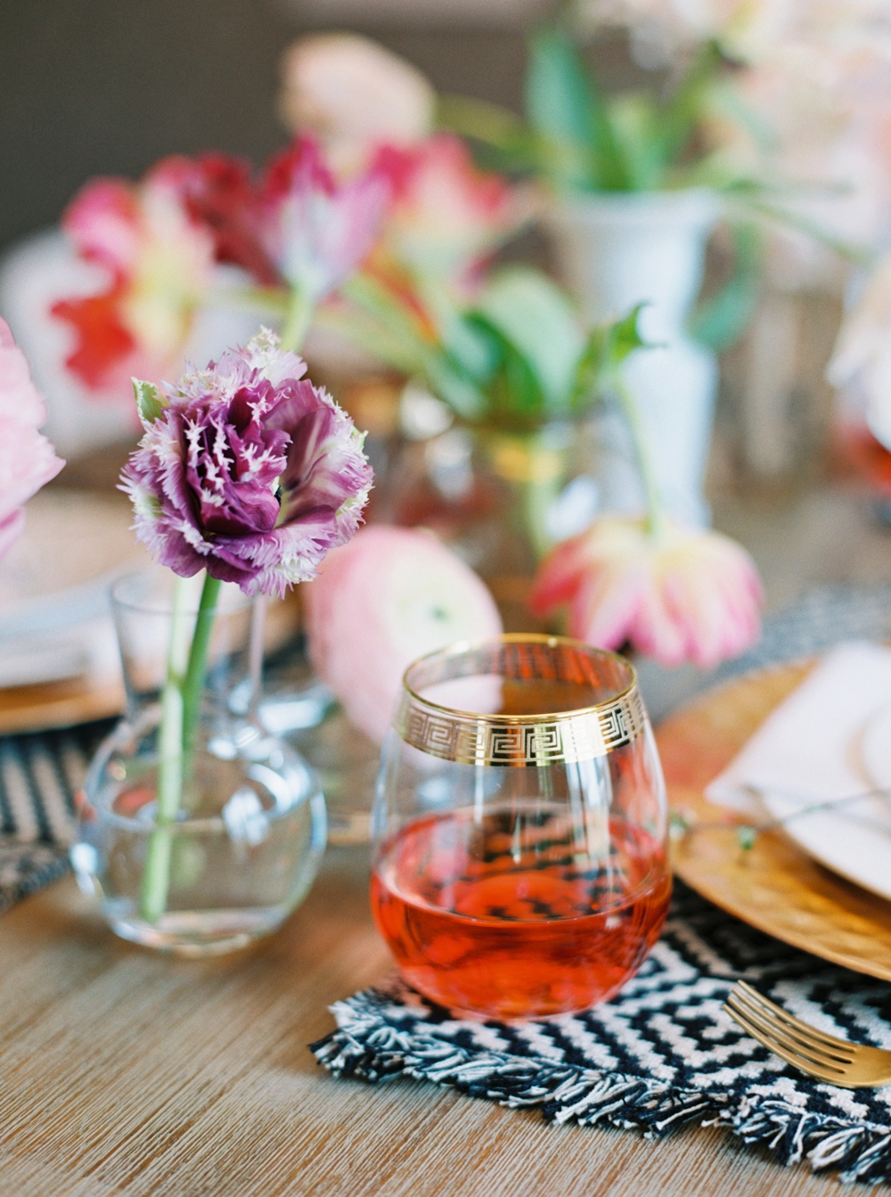
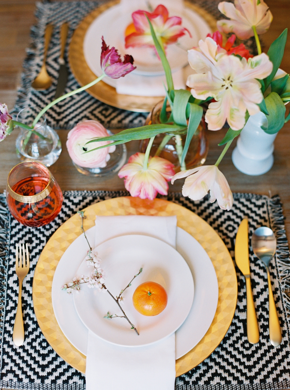
I love to have fresh flowers at home when I can — and this colourful arrangement totally brightens up my kitchen! The blossoming branches are actually from a Nanking Cherry Tree in Rebecca’s Mom’s yard. We both like to bring the outside in and I love the organic look they give the arrangement. I wanted something bright, cheerful and colourful that complimented the type of food I like to make — plant-based, fresh and seasonal. Rebecca is very skilled in taking my ideas and bringing them to life with her signature, artfully undone aesthetic.
It’s funny — even though the kitchen is obviously where the cooking goes down, it’s not where I take my food photos. I think that’s probably the case for most bloggers or stylists. I have a perfectly lit little corner in the southwest part of our main living area — it’s become my set for just about all the blog photos I take. That’s why you’ve never seen my kitchen!
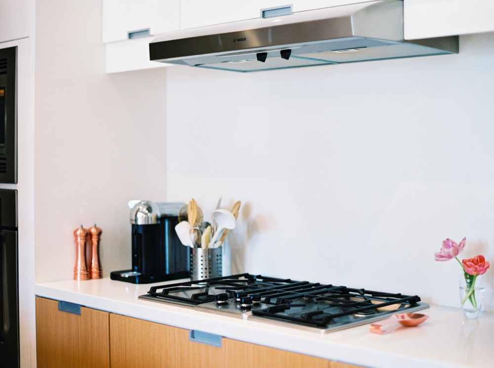
One of the main things that drew us to this space was its sleek lines and simplicity. When we were looking for our home 4 years ago it was so different from anything else we’d seen. We both tend to favour modern architecture and it was love at first sight! Even though our space is modern, I love that it still feels warm and inviting. Industrial architecture often feels cold to me, so I love the light, bright hues and natural wood textures of our kitchen. And I’m still obsessed with copper accents!
