All my best tips for styling flat lays are in the IG reels below!
But if you need a summary of the reels:
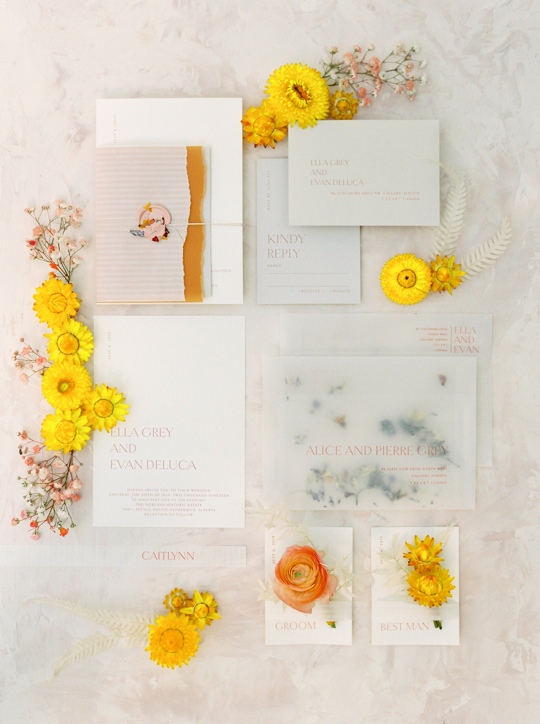
1. Watch for uniform lines, avoid these by layering some pieces!
2. Start with your main pieces, always keep the invite on top when layering, don’t put other pieces on top of it!
3. Balance out any items of the same color by putting them on opposite sides of the frame, usually trying to create a bit of a curve for the eye to follow. I like to rotate envelopes to be length ways if I need to fill my frame up more and create some directional interest!
4. Add some contrast & balance it by adding in some styling accessories like ring boxes.
5.. Add some depth to the image by raising up some of your pieces! using clear acrylic styling blocks!
6. The spacing between items should be even or at least make sense and not be distracting or cause any “holes” in the layout.
7. STRAIGHTEN YOUR PIECES!!!!! Sometimes this is hard with handmade pieces because they are not perfectly square, but do your best! If they are perfectly square its pretty easy to fix when shooting, much harder to fix afterwards. The stationer will thank you for this!
You can even watch me style a stationery suite in some of them!
